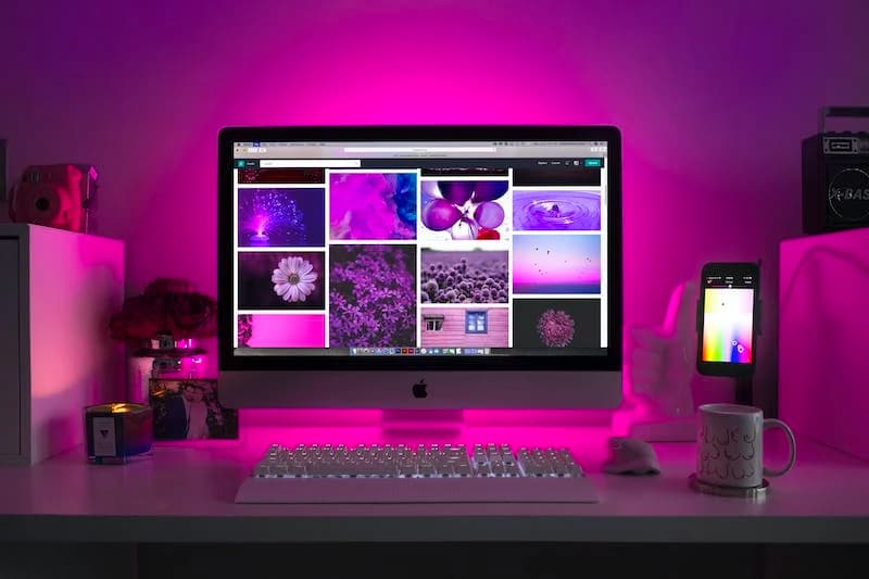
Web design and colour are closely intertwined elements of web development and user experience. The choice of colours in web design can have a significant impact on a website’s aesthetics, usability, and overall effectiveness. Here are some important considerations when it comes to colour in web design.
Brand Identity
The logo is the most recognizable visual element of a brand. It often incorporates symbols, typography, and colours that represent the brand’s essence and values. The colour scheme of a website should align with the brand’s identity. Consistency in colours across all brand assets, including the website, logo, and marketing materials, helps reinforce brand recognition and trust.
Colour Psychology
Different colours evoke different emotions and reactions. It’s essential to understand colour psychology and choose colours that resonate with your target audience and the message you want to convey. For example, blue is often associated with trust and professionalism, while red can signify urgency or passion. If you’re interested in learning more about colour psychology, here are some books that delve into the topic:
- “Color Psychology and Color Therapy” by Faber Birren
- “Pantone: The 20th Century in Color” by Leatrice Eiseman and Keith Recker
- “The Secret Lives of Color” by Kassia St. Clair
- “Color Choices: Making Color Sense Out of Color Theory” by Stephen Quiller
- “Color: Messages and Meanings” by Leatrice Eiseman
Readability
The text on a website must be easy to read. The contrast between text and background is critical. Dark text on a light background or vice versa is a standard choice for readability. Avoid using low-contrast colour combinations that strain the eyes. Sans-serif fonts like Arial, Helvetica, or Roboto are commonly used for online content due to their clarity.
Accessibility
Web design should be inclusive, and this includes considering colour accessibility for individuals with visual impairments. Ensure that text and background colours meet accessibility standards (such as WCAG guidelines). Accessibility benefits not only individuals with disabilities but also improves the overall user experience for everyone. Implementing accessibility best practices in web design makes your content more inclusive and reaches a broader audience. It can also help your website comply with legal requirements related to web accessibility in some jurisdictions.
Consistency
Consistency is a crucial principle in web design. It refers to maintaining a uniform and coherent look and feel throughout a website. Maintaining a consistent colour scheme throughout the website helps users navigate and understand your site better.
Highlighting Calls to Action
Important elements like buttons, links, and calls to action (CTAs) should stand out. Using contrasting colours or bold, vibrant colours for these elements can draw users’ attention and encourage interaction.
Responsive Design
Be mindful of how colours appear on different devices and screen sizes. What looks good on a desktop monitor may not be as effective on a mobile phone or tablet. Test your colour choices across various devices to ensure a consistent user experience.

White Space
White or negative space is an essential part of web design. It helps balance the layout and makes content more digestible. The strategic use of white space can enhance the impact of your chosen colours. Also, white space reduces cognitive load by preventing visual clutter. When users encounter a clean, well-organized layout with adequate spacing, they can focus on the content without feeling overwhelmed or distracted.
Aesthetic Appeal
While functionality and accessibility are crucial, the aesthetic appeal of a website matters as well. Colours can evoke emotions and make a site more visually pleasing, which can contribute to a positive user experience. However, aesthetics should not come at the expense of usability and functionality. An aesthetically appealing website should also be user-friendly and effectively communicate your content or message to your target audience.
User Testing
Before finalising youаr colour choices, consider conducting user testing or gathering feedback from your target audience. This can help identify any issues with colour perception, readability, or preferences.
Remember that web design involves more than just choosing colours. It’s about creating a user-friendly and visually appealing interface that effectively communicates your message and achieves your website’s goals. Colour is one of the many tools in a web designer’s toolkit, and it should be used thoughtfully in conjunction with other design principles.
